Data analysis and data engineering
Your business costs are rising. Can you prove which ones are killing you?
Running a business gets more expensive, but knowing exactly what changed, where, and by how much is surprisingly difficult.
The data exists.
Diesel. Petrol. Cooking gas. Transport fares. Food. Electricity. Inflation.
But it is scattered across eight different government sources, published in different formats, at different times, and at different levels of geography.
So I brought it together.
Not to calculate the total cost of running a business in Nigeria. The available data cannot honestly do that.
The goal was simpler:
Show how major external business costs are changing, where they differ, and which ones a business may need to pay attention to.
The problem
Your costs went up.
But which ones?
And by how much?
Maybe diesel became more expensive. Maybe transport did. Maybe electricity, petrol, food or cooking gas moved enough to affect what you spend every month.
The problem is that seeing those changes together is difficult.
The numbers are public, but they live in separate reports from different agencies, using different structures and release schedules.
That leaves business owners feeling the increase without having a clear picture of where it came from.
One example is diesel.
From its low point in September 2025 to May 2026, the median increase across Nigeria's 36 states and the Federal Capital Territory was 158.2%.
That is the kind of change a business should be able to see clearly.
So I built one place to see it
Nigeria Business Cost Intelligence brings these datasets together and tries to answer three practical questions:
What went up, and by how much?
Does the answer change depending on where you are?
Is this a cost a business like mine should pay attention to?
The project tracks nine major cost categories over time across all 36 states and the Federal Capital Territory where state-level data actually exists.
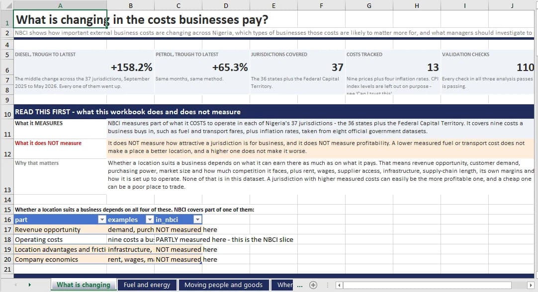
The workbook tells you what it measures and what it does not before showing a single chart.
But putting the data together turned out to be the easy part.
The harder part was making sure the result did not quietly say things the original data never said.
The data does not all fit together
The obvious approach would be to download every dataset, match everything by state and month, and build a dashboard.
That would look clean.
It would also be wrong.
Three of the eight sources do not publish state-level figures at all.
Food is published by region.
Electricity is published by electricity supply area.
The exchange rate is national.
If I forced those numbers into a table containing one row for every state, I would be creating geographic detail that never existed in the source.
So I did not.
Each figure stays at the level at which it was actually published: state, region, national, or electricity supply area.
Nothing is pushed down to a lower level simply because it makes the dashboard easier to build.
That same rule applies to missing data.
The project contains 342 raw source files, roughly 1.6 GB in total. Every file is verified using SHA-256 hashing when it is downloaded and again after processing.
The sources come directly from the original publishers. No Kaggle copies. No mirrors. No aggregators.
And when an official file is missing, the project records the gap instead of filling it with an invented value.
Then came the messy part
Before writing the transformation pipelines, I profiled 219 spreadsheet sheets and 173 PDFs.
That exposed problems that would be easy to miss if the files were simply loaded automatically.
NBS header rows, for example, are not consistently placed. Across different releases, they appear on rows 1, 2, 3, 4, 15 and 16.
A script that assumes the first row contains the column names works for some files and quietly breaks others.
Petrol has another problem.
One worksheet contains two different tables side by side. Columns 1 to 4 contain state data, while columns 6 and 7 contain zones with completely different meanings.
Diesel mixes states, zones and the national total inside one unnamed column.
Cooking gas contains separate tables for 5 kg and 12.5 kg cylinders using identical column names. The only reliable way to distinguish them is their position in the sheet, and even those positions changed in 2026.
One transport file labels two columns with the same period even though the second column actually belongs to the following March. I verified that by comparing values across 33 states with the next month's official release.
Any one of these problems could quietly corrupt an automated pipeline.
So the system was designed around the source files as they actually exist, not around how convenient I wanted them to be.
The database keeps those differences intact
Once cleaned, the data lands in PostgreSQL.
The database contains 29,032 fact rows across 12 core fact tables, with 30 analytical mart objects built on top.
The important part is not the row count.
It is what the model refuses to combine.
State data stays state data.
Regional data stays regional.
National data stays national.
Electricity supply areas stay electricity supply areas.
Every figure carries its geographic level with it.
That prevents a chart from implying more detail than the source actually provides.
Some restrictions go even further.
The national statistics source explicitly warns that its state price indexes should not be used to rank states by cost because each state's basket is different.
That warning is attached to all 6,512 relevant rows.
The dashboards are also prevented from violating it.
Those index measures are excluded from the Excel data layer completely. In Power BI, the corresponding measure returns blank instead of allowing an invalid comparison.
The model even contains six missing relationships on purpose.
For example, food has no state-level prices, so the relationship that would allow someone to chart food by state simply does not exist.
The model cannot accidentally answer a question the source data cannot support.
Then I built the Excel workbook
The workbook contains seven sheets.
Instead of naming them after datasets, each one is named after the question someone using the data is actually trying to answer:
What is changing
Fuel and power
Moving people and goods
Where costs differ
Is this month's price move unusual
Who this matters more for
Can I trust this
Every sheet follows the same pattern.
First, it states the finding in plain English.
Then it shows the chart or figures behind that finding.
Then it explains what the data cannot tell you.
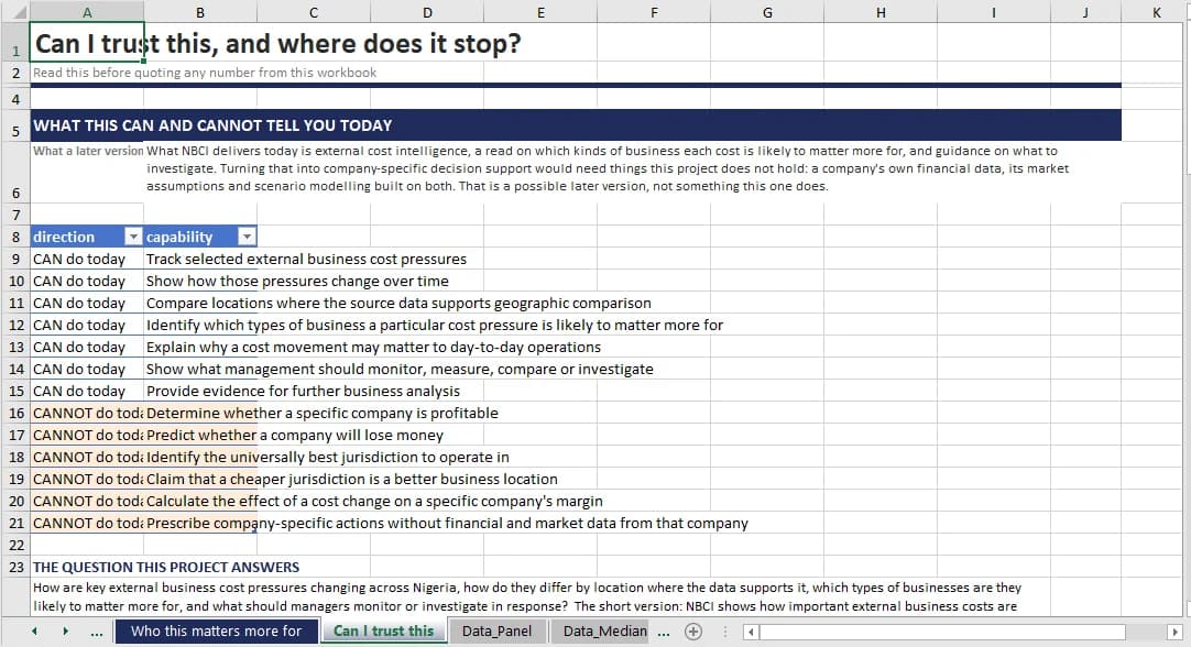
Seven things it can do today. Six it cannot.
Those limits are not just explanatory text.
The workbook contains seven things the project can do and six things it cannot do, stored as structured data so those claims stay consistent throughout the project.
The same logic carries into Power BI
The Power BI report is built as a project, not a single binary file.
The semantic model uses TMDL and the report uses PBIR, which means both exist as plain-text project files that can be inspected properly in version control and code review.
The finished report contains seven pages, 98 visuals, 37 tables, 47 measures and 24 relationships.
But the first page does not open with a giant KPI.
It opens by explaining the boundary of the analysis.
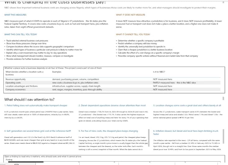
The first page opens on the boundary of the analysis, not on a headline number.
Only after that does the report start showing what happened.
And some of what happened was much larger than I expected.
What the data showed
Diesel more than doubled
From its low point in September 2025 to May 2026, diesel rose by a median 158.2% across the 37 jurisdictions.
Every jurisdiction recorded an increase.
Even the smallest increase was 115%.
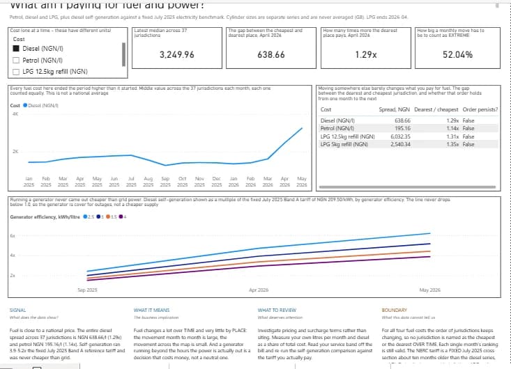
Diesel from January 2025 to May 2026, with the self-generation line never dropping below the grid tariff.
The chart title does not make you interpret the line before understanding the point.
It tells you:
Every fuel cost here ended the period higher than it started.
Falling petrol prices did not automatically mean cheaper transport
There were 81 cases where petrol was cheaper than it had been a year earlier.
Transport fares often did not follow it down.
Motorcycle taxi and water transport fares were still higher in 100% of those cases.
City bus fares were higher in 98.8%.
Fuel costs can fall without the transport prices businesses and customers actually pay falling with them.
Headline inflation did not describe every cost pressure
Over the period examined, the headline inflation rate fell from roughly 22% to 15%.
At the same time, motorcycle taxi fares rose by roughly 51%.
A business using headline inflation alone to adjust transport allowances would therefore have been roughly 35 percentage points behind the change in that particular transport cost.
The national inflation number was moving one way while a cost businesses actually pay was moving another.
Generators were consistently more expensive than the reference grid tariff
Across every month in the series, estimated diesel self-generation cost between 3.9 and 5.2 times the reference electricity tariff.
The result is simple.
A generator may be necessary when grid power is unavailable, but in this dataset it was never the cheaper source of electricity.
Location matters far more for some costs than others
Water transport fares differed by almost seven times between the lowest and highest jurisdictions.
Petrol differed by only about 1.14 times.
So saying that "location matters" without asking which cost hides most of the useful information.
For some costs, geography changes the picture dramatically.
For others, the difference is relatively small.
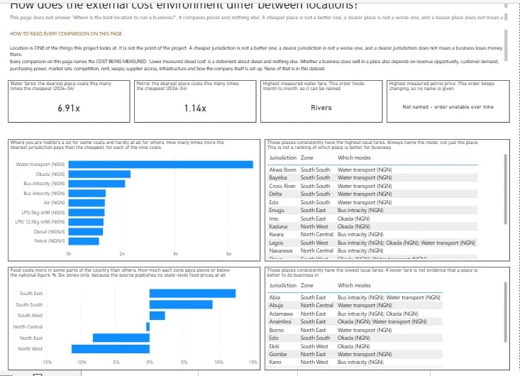
Location is one of the things the project looks at, not the point of it.
And even when a place is cheaper in one month, that does not make it permanently cheaper.
For five of the nine costs, the lowest-cost jurisdiction keeps changing.
In those cases, a single month's movement can be larger than the entire gap between the lowest and highest jurisdiction.
So the ranking reshuffles.
The project can show what was cheapest in a particular month.
It does not pretend that one jurisdiction is permanently the cheapest.
What does any of this mean for an actual business?
The project deliberately stops short of telling a business owner what to do.
It cannot see your company's margins.
It does not know how much diesel you use.
It does not know what percentage of your costs goes to transport.
It does not know whether you can pass a price increase on to your customers.
So a national number by itself cannot tell you how serious a change is for your particular company.
Instead, the project helps narrow the question.
Find the type of business closest to yours.
Look at the costs that kind of business is likely to buy heavily.
See how those costs have moved.
Then compare that with the number the public datasets cannot know:
How much of your own spending goes there?
A 158% increase in diesel could be a major event for a company that depends heavily on generators and logistics.
For a business that barely buys diesel, the same national change could have little effect.
Same external number.
Different business.
Different consequence.
That is also why I do not call this "the cost of doing business"
The project tracks nine external costs businesses may buy, plus inflation measures.
That is not the same thing as measuring the complete cost of running a business.
There is no rent.
No wages.
No land.
No taxes or levies.
No inventory costs.
Because those things are absent, the project does not claim to predict whether a company will make or lose money.
It also does not identify the "best state for business."
A location having cheaper fuel or transport does not automatically make it a better place to operate.
A business also depends on customer demand, purchasing power, market size, competition, supplier access, infrastructure, wages, rent and many other factors that are outside this dataset.
Those limitations are part of the system, not a disclaimer added at the bottom.
They are stored as data in both tools.
They appear directly inside the dashboards.
And the build contains language checks that reject claims such as "best state" or "cheaper place to do business" before the final output can ship.
Then I tested whether I could trust my own work
This became one of the largest parts of the project.
The analysis layer passes 110 out of 110 checks across three separate validation passes.
The PostgreSQL database has an independent audit containing 245 out of 245 passing checks.
That audit does not simply trust what was loaded into the database.
It goes back to the 17 source CSV files, parses them again from scratch, and reconciles the result independently.
The dashboards are tested separately too.
The Excel workbook goes through 105 structural and reconciliation checks, plus 25 Microsoft Excel compatibility checks.
Every headline number is recalculated and compared with its committed evidence.
The workbook is hashed before and after validation. The two hashes must match, proving the validator inspected the file without altering it.
The Power BI report goes through another 89 checks.
The process opens the project in Power BI Desktop, removes the existing data cache, performs a genuine refresh, and interrogates the live model directly.
That level of validation came from learning the hard way that a successful build message proves very little.
An early workbook passed its build process while still containing 20 invalid numeric values inside its XML.
The logs said the workbook had been written successfully.
The file itself was wrong.
That changed the standard for the rest of the project.
A tool saying "success" is not proof.
The output has to survive independent testing.
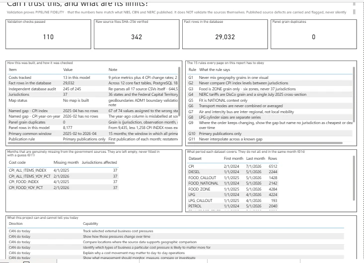
Every check, every verified file, and every gap the sources left, on one page.
That is how the project ends up with:
110 analysis checks passed
342 raw files hash-verified
29,032 database fact rows
0 panel-grain duplicate rows
And when the source itself is incomplete, the dashboard shows that too.
Eleven expected government releases that were not published remain missing.
They are named directly on the validation page.
If a year-on-year comparison cannot be calculated because the comparison month is missing, the chart breaks the line rather than pretending the gap does not exist.
Built with
Python and pandas for cleaning and transformation.
PostgreSQL for the database and analytical mart.
SQL for analysis.
Power BI using a text-based project structure.
Excel generated and independently validated by script.
Git throughout the build, with each stage committed as it was completed and verified.
The repository contains the cleaning pipelines, schema, analysis code, validation suites and dashboard projects:
github.com/Qui-vira/nigeria-business-cost-intelligence
Why I built it this way
The useful part of a dashboard is not how certain it looks.
It is whether the numbers still hold up when someone starts asking questions.
Where did this figure come from?
Was that geography actually published?
What happens when a source file is missing?
Can I reproduce the calculation?
What does this number not prove?
Nigeria Business Cost Intelligence was built so those questions have answers.
Not to make the data look cleaner than it is.
Not to turn incomplete information into certainty.
But to take scattered public data, make it usable, and make sure every conclusion stops exactly where the evidence stops.
If you need data work where the numbers are expected to survive someone actually testing them, this is what that looks like.